Email Designer Advanced Topics
Below are some advanced topics related to the Email Designer.
Image best practices
It's important to use images in your email, but too many images can flag your email as potential spam. And, images should be resized for optimal display in the email.
The best-practice dimension of an email is 640 px wide. If your image is wider than 640 px it means the image will have to be resized to fit in the email and the image file size is likely bigger (and will take longer to download).
- Try to strike a balance between images and text content.
- Add images to email containers so the container automatically adjusts the image size.
- Be sure the image width is set to 100% when used in a container. This will enable the image to automatically scale on smaller devices.
Use scalable images
By default any image added to your email through the designer will have a width of 100%. This will allow the image to resize itself automatically on smaller screens.
However, it is possible to set the height/width to different percentages as well as fixed height/width where a specific height, e.g. 300px, is specified.
Setting fixed width/height for an image should only be done for images that are not meant to scale. Furthermore, a best practice is to only use an image already at the correct size.
WarningImportant: Incorrectly setting an image to a fixed height/width will cause the image to display incorrectly on mobile devices.
Building mobile friendly (responsive) emails
The majority of your email will be read on mobile devices. And, it is important to optimize the email for mobile devices.
First, ensure that for any fixed width tables, there is a CSS media query for your email so that the tables can be set to 100% width. While this won't help for Microsoft Outlook clients, your iOS and Android mobile users will be appreciative.
Editing HTML in the designer
While typically not recommended, it is possible to add/edit HTML directly in the designer using a Text / HTML block.
Adding whitespace between widgets in your email
Whitespace is important to use in any design, but especially emails where you want to use whitespace to increase readability.
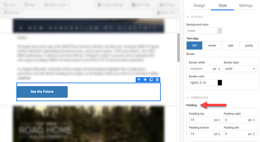
For example, if you have a set of buttons that are stacked, you had change the top and bottom padding of those buttons to create whitespace:
