Two Column Container
The Two Column Container widget is a very flexible layout widget you can use to achieve various formatting options in the body of your email. It's is fully mobile friendly and can either stack columns in mobile devices or not stack columns in mobile.
Using the Two Column Container
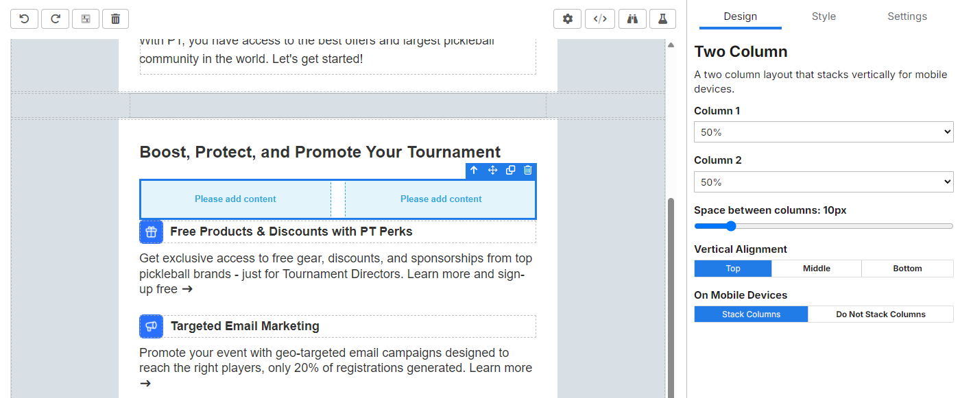
When the Two Column Container is added to an email, it is initially configured to show two columns each allowed 50% of the display area. It is initially configured with a pre-set spacing of 10px between the columns:
Using the options in the Design section, these options can be configured.
Setting Column Width
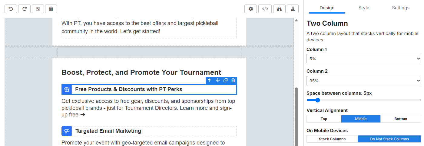
Changing the column 1 percentages from 50% to 10% changes the column percentage of column 2 to 90%:
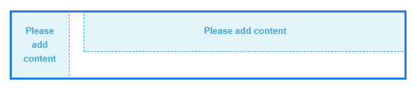
This layout enables complete flexibility for the size of the columns to accommodate various formats.
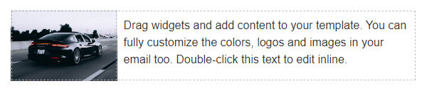
For example, an image in the left column that has a width of 150px along with text in the right column:
Setting Space Between Columns
Using the Space between columns slider you can control the exact spacing between columns.
It's recommended to use spacing between column instead of setting padding on items within the columns. When columns stack on mobile the space between columns is eliminated. If padding is used on an element the padding is still shown on mobile.
Setting Vertical Alignment
The Vertical Alignment option enables you to control how the items in each column align vertically. The default is for items to align to the top, but you may want to use other alignment options depending on the desired layout. For example, to show an icon next to a header:
In the example above, using Vertical Alignment eliminates the need for padding around the text to attempt to middle align it with the icon.
Mobile Device Behavior
The default behavior is for columns is to stack vertically on mobile. This simply means that a two column layout will convert to a one column layout with the left most item shown on top.
However, for certain designs, column stacking is unnecessary. To prevent stacking on mobile simply toggle the Do Not Stack Column option for On Mobile Devices.