Using the Email Designer
Please review our tutorial video or scroll below for step-by-step instructions:
The Email Designer is a drag-and-drop design canvas used to more easily build and design beautiful emails. We put together this guide to help you understand how to use the DailyStory Email Designer.
Overview
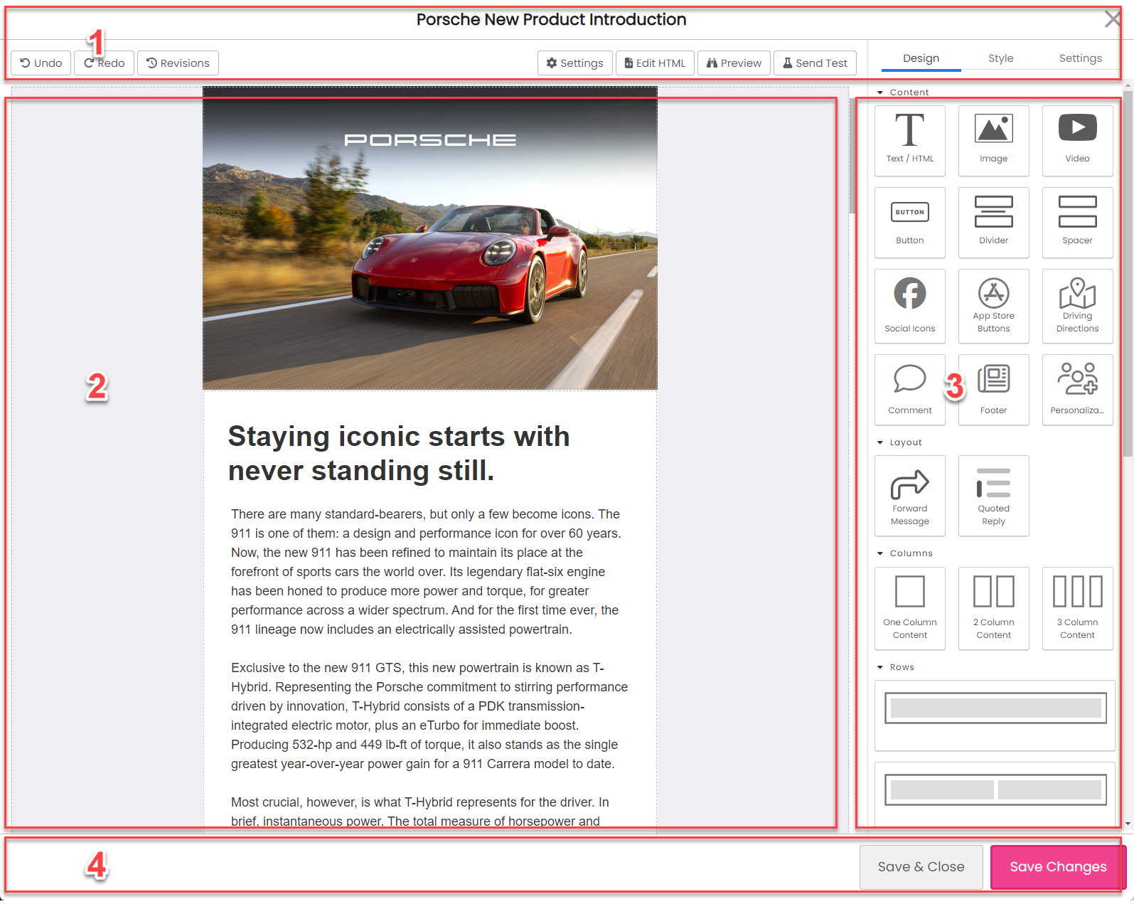
The Email Designer has 4 main sections:
- Top menu bar - includes the name of the email, buttons and more options
- Design Canvas - the area where design widgets are placed
- Widget Menu - widgets that are drag-and-dropped onto the design canvas
- Save buttons - buttons for saving, copying and more
Top menu bar
The top menu bar displays the name of the email you are editing and also show contextual buttons.
Buttons shown when a widget is not selected
The contextual buttons shown in the top menu bar will change when widgets on the design canvas are selected.

On the left-side of the menu:
- Undo a previous action, e.g. undo removing a widget from the canvas.
- Redo a previous action, e.g. remove a widget from the canvas.
- Revisions provide access to previous revisions of the email that may be restored.
On the right-side of the menu:
- AI Grammar and Spell Check provides a review of your emails grammar and checks for spelling errors.
- Settings return to the email settings screen.
- HTML edit the HTML (see warning below).
- Preview preview how the email will look.
- Send Test send a test to one or more email addresses.
Buttons shown when a widget is selected
When a widget is selected in the designer the left-side menu buttons expand to include more options:
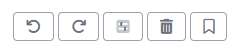
The revisions button is hidden and three new buttons are added:
- Show all widgets this button is a quick way to get back to the designer widgets.
- Delete widget deletes the selected widget.
- Save widget saves the selected widget as a reusable widget.
Be cautious making direct changes to the HTML of the email in the HTML designer. Emails built with the designer are optimized for multiple devices and screen sizes. Change to CSS, Plain Text, and AMP may be done safely.
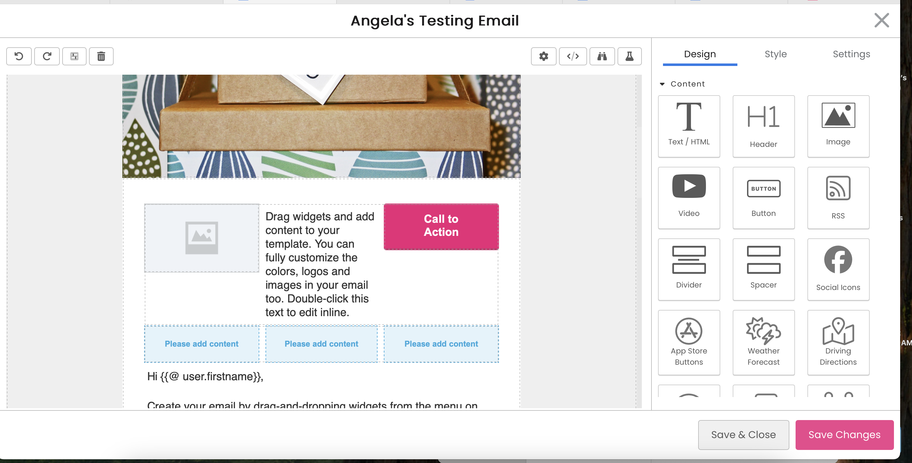
Design Canvas
The Design canvas is where widgets are placed or selected by dragging-and-dropping them from the Widget Menu.
The Email Designer is built to support working with pre-made email templates or building new emails 100% in the designer.
WarningIf you are working with a pre-existing HTML template for your emails. This email should be created as a new Email Template. Furthermore, HTML elements within the template can use special mark up to identify which HTML sections are editable and which are not.
Widget Menu
The widget menu contains various email widgets that you can drag-and-drop onto the design canvas.
The easiest way to get started is to use one of the pre-built templates and then experiment with the widgets.
Selecting widgets on the design canvas
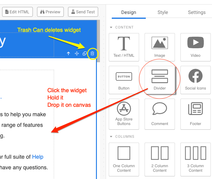
When moving the mouse over the canvas a blue box will highlight widgets. To select the highlighted widget click on the widget. When the widget is selected it is outlined and a contextual toolbar is shown on the top right of the widget:
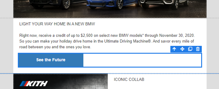
There are multiple types of widgets in the designer that may be selected. In the above example, a button container widget is selected. You can also select the individual button in the container.
Widget toolbar
- Up arrow selects the parent of the widget
- Cross arrows enable click-and-drag to move the widget
- Copy create a copy of the widget
- Trash remove the widget
Adding and removing email widgets
To add a widget drag-and-drop it from the widgets menu on the right.
When a widget is dragged on to the design canvas the parent widget where the widget is placed is highlighted in yellow and a green bar indicates where the widget will be placed.
To remove a widget, select it on the canvas and then click on the trash can.
Setting widget design, styles and other options
Once you select a widget on the canvas, you'll notice three tabs for most widgets on the right hand side:
- Design tab: rich text editor to insert and edit text.
- Style tab: set font styles, colors, alignment, padding etc.
- Settings tab: desktop sizing, etc.
Styling Widgets
The Style tab is used to set style details about the selected widget. These options will change based on the type of widget selected.
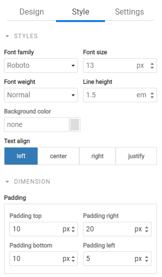
- Font family the font used for text, e.g. Helvetica
- Font size the size of the font, e.g. 20px
- Font weight the weight of the font, e.g. bold
- Line height the spacing between lines, e.g. 24px
- Color the color of the text, e.g. #FFCC2A
- Background color the background color of the widget, e.g. #FFFFFF
- Text align the alignment of the content in the widget, e.g. center
- Padding the whitespace surrounding the widget, e.g. 15px
- Width the width of the widget, e.g. 100%
- Height the height of the widget, e.g. 250px
- Min width the minimum width of the widget, e.g. 100px
- Min height the minimum height of the widget, e.g. 100px
- Max width the maximum width of the widget, e.g. 500px
- Max height the maximum height of the widget, e.g. 500px
Some style values, such as Min and Max height and width are not supported by Microsoft Outlook.
An email is built using rows to control the layout and then content widgets are drag-and-dropped to determine how content is displayed.
Saving and reusing widgets
After dragging-and-dropping a widget on the design surface it is common to further customize the widget's content, style (color, fonts, etc.) or other settings. For example, setting the city for the weather widget, choosing a destination address for the driving directions widget, or modifying the social icons widget to remove channels that you organization does not use.
Saving widgets enables you to tailor a widget in the designer to your needs, save it, and then easily re-use it as a drag/drop widget.
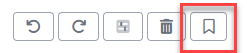
How to save a widget
Select a widget you want to save and in the toolbar click the save widget icon:
You will be prompted to give your new widget a name. If you want to update one of your saved widgets, just use the same name.
Currently, you can have a maximum of 12 saved widgets. And all saved widgets are shared amongst all users.
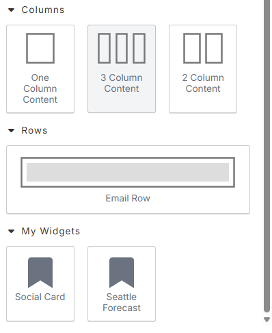
How to use a saved widget
To use a saved widget scroll to the bottom of the Design tab and find the "My Widgets" section. Next, just drag-and -drop your widget like you would any other.
How to delete a saved widget
To delete a saved widget find the widget in the "My Widgets" section. Hover over it and click the X in the top right corner. This will remove the widget. However, any emails that used this widget will be unaffected.
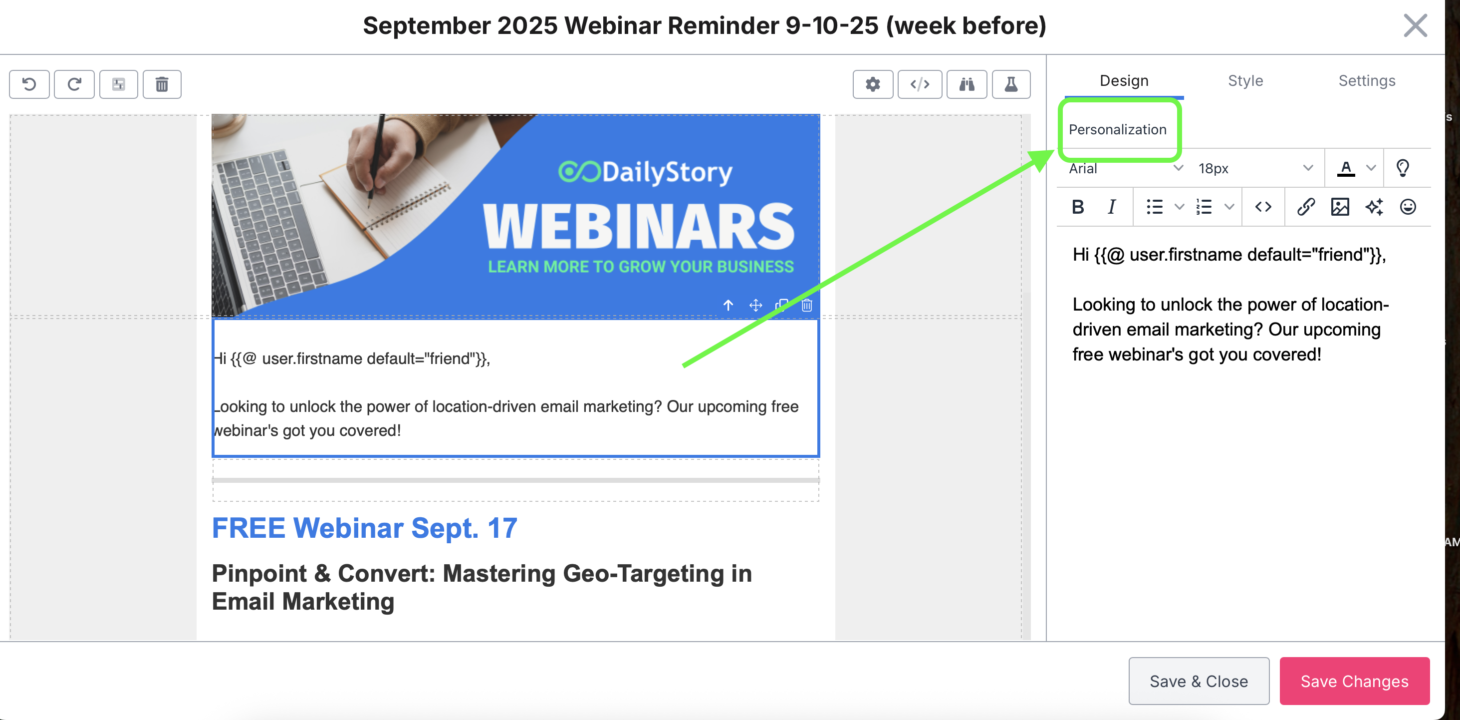
Personalization
You can now insert personalization tokens directly into your email content. Once you click on a text box to edit, you'll see the option to select Personalization tokens to add:
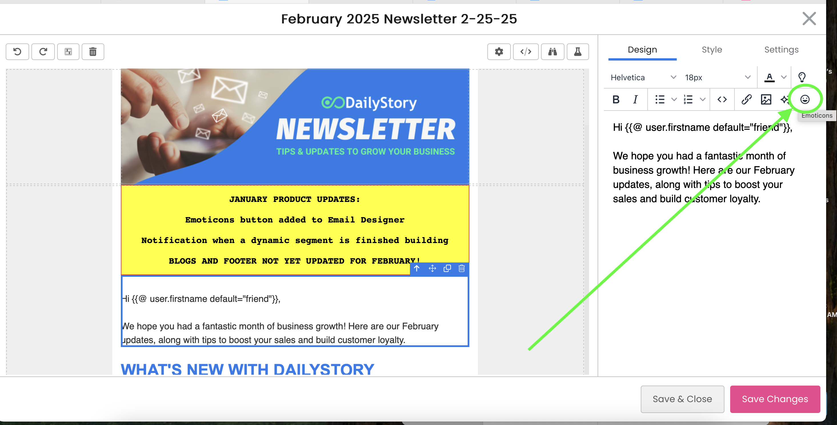
Using Emoticons
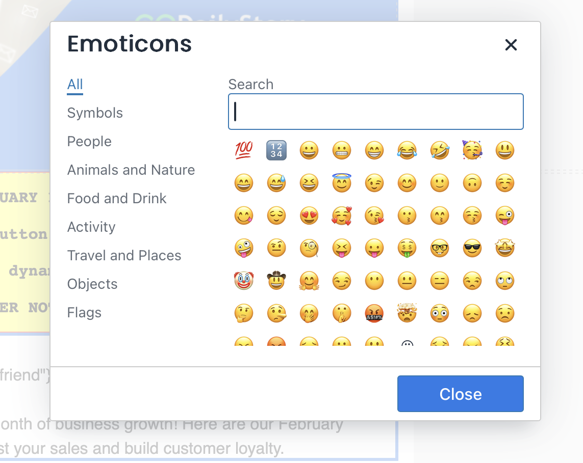
We now offer an easy way to add emojis to the body of your email, without having to copy/paste! In the email designer, after selecting a text box, you'll see the 😀 emoji:
After clicking on the emoji symbol, a pop will appear, and you can select any emoji of your choice.
Working with Columns
For more advanced email layouts, you'll need to familiarize yourself with columns.
You have the option for 1, 2 and 3 column content and these are dragged-and-dropped on to the design canvas. In the screenshot below, 3 columns are added to the design canvas. Each row can have separate backgrounds, padding, and other settings.
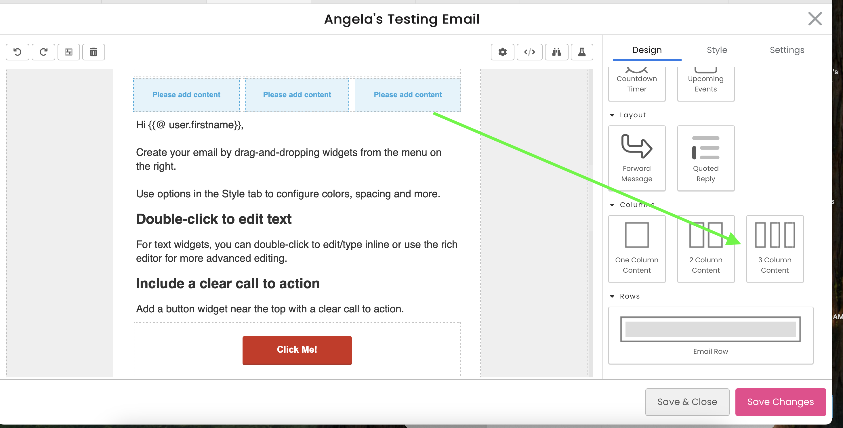
A row displays the text "Please add content" as a target where other widgets are dragged-and-dropped onto the canvas. You can see the below where an image, text and button widget were added: