Configuring a Popup's Basic Settings
Name
The name you give your popup is for internal use only.
Content
Body content should be brief. Use common formatting options from the drop down and quick menus. You can also use the return key to create line breaks in the content.
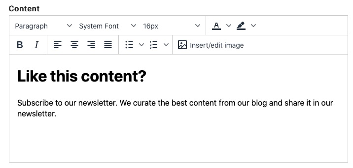
The body content is wrapped in a
tag with
to handle line breaks. CSS settings for #ds_pop .content p
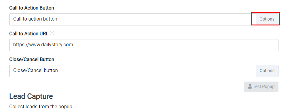
Call to Action Button
The Call to Action button is the primary action you want viewers to take. When clicked, the call to action button can navigate to another URL or capture a name and email address (see Lead Capture Form below for more details).
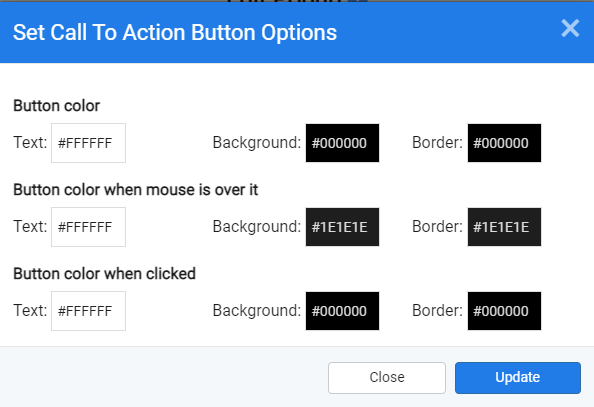
You can customize the text for the Call to Action Button as well as set colors and behaviors.
Click on the Options button for the additional options window.
The call to action button applies CSS settings for #ds_pop a#ds_pop_action_button
When the Call to Action button is clicked by a visitor, the popup will not be shown to that user again.
Call to Action URL
The Call to Action URL is the URL is where the visitor will be directed once they click on the Call to Action button.
If Lead Capture fields are configured (name, email or phone), the information entered will will be captured in the lead's record, added to the associated campaign as a lead and then redirected to this URL.
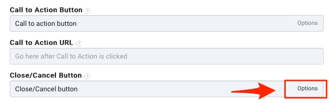
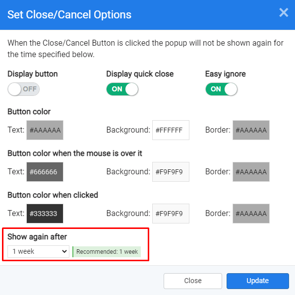
Close/Cancel Button
The Close/Cancel button is used to close the popup because the offer presented to the visitor is not of interest.
You can customize the text you want on the Close/Cancel button as well as other specific formatting and behavior. Click on Options for the additional options window.
The Close/Cancel button options present three toggles:
- Display button - enabled by default, this determines if the Close/Cancel button is shown.
- Display quick close - enabled by default, this determines if the X in the upper-right corner is shown.
- Easy ignore - disabled by default, this allows clicking outside of the popup or pressing escape to close the popup.
 Warning
It is important to note that it is possible to configure the popup with no way to close except for the call to action.
In addition to the behavior toggles there are options for setting the button colors/style.
Finally, the Show again after option enables you to configure how long to hide the popup after the close/cancel button is clicked.
By default, when the Close/Cancel button is clicked the popup will not be shown again to that visitor for one week but you can figure it from 10 minutes to 6 months from the drop down.
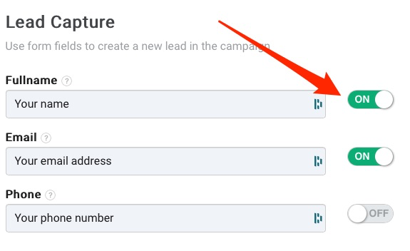
Lead Capture
There are three lead capture form fields avaiable for your popup: Fullname, Email and Phone. You may rename these fields as well as decide which fields you would like to capture on your popup by turning the toggle button ON/OFF.
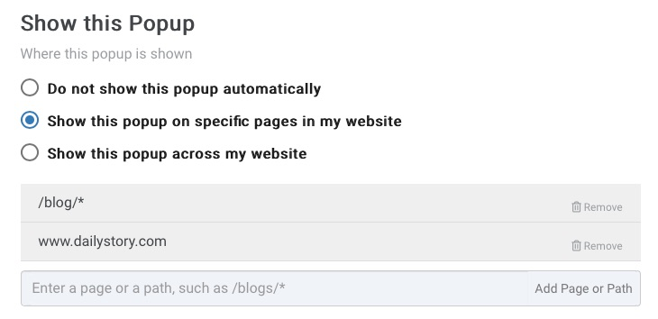
Show this Popup
Show this Popup determines where the the popup is shown and is in fact how you enable your popup. To start showing your popup you need to either of the two latter options.
If you select Show this popup on specific pages in my website, you need to add the page or path where you would like it shown.
For example, you can create a popup that is only shown to visitors of your blog by using a path of /blog/*.
Testing your Popup
Now that you've created a popup. You can test your popup to see what it will look like when shown to your website visitors.
On the bottom right of the popup editor, just below the Close/Cancel Button section, you will see a button that says, "Test Popup".
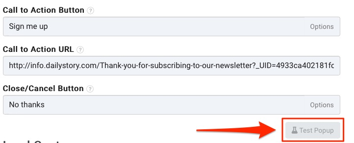
Clicking this button will open a new browser tab. After a 2 second delay your popup will be shown.

Once you have verified that your popup looks like you expect you can close the popup tab.